8 touch points with a curved trendline breakout at POLICYBZROn the #POLICYBZR daily chart, there is a Double Bottom #Breakout and there are 8 touch points with a curved trendline breakout. The reversal is also confirmed by the Nifty/POLICYBZR ratio chart. I compared #POLICYBZR to the #Nifty and its peers over the last 123 trading sessions and discovered that it is currently outperforming both the Nifty and its peers in the sector.
BSE: 543390
NSE : POLICYBZR
ONLY FOR #educational
NOT SEBI REGISTERED. #LEARNEARN (TRUST YOURSELF)
#nifty50 #sharemarket #BREAKOUTSTOCKS #Multibagger #sharemarket #sharemarketindia #sensex #technicalanalysis #Chartanalysis #headandshoulders #doubletop #doublebottom #parallelchannel #relativestrength
DISCLAIMER: I am not SEBI registered analyst. All posts are for educational purpose only. I am not responsible for your any loss or profit. Consult your adviser before taking any trade. I help people to learn technical analysis & charts reading.
Search in ideas for "RATIO CHART"

3 touch points with a curved trendline breakout at FSLOn the FSL daily chart, there are 3 touch points with a curved trendline breakout. The reversal is also confirmed by the Nifty/FSL Ratio chart. I compared FSL to the Nifty and its peers over the last 123 trading sessions and discovered that it is currently outperforming both the Nifty and its peers in the sector.
BSE: 532809
NSE : FSL
ONLY FOR #educational
NOT SEBI REGISTERED. #LEARNEARN (TRUST YOURSELF)
#nifty50 #sharemarket #BREAKOUTSTOCKS #Multibagger #sharemarket #sharemarketindia #sensex #technicalanalysis #Chartanalysis #headandshoulders #doubletop #doublebottom #parallelchannel #relativestrength
DISCLAIMER: I am not SEBI registered analyst. All posts are for educational purpose only. I am not responsible for your any loss or profit. Consult your adviser before taking any trade. I help people to learn technical analysis & charts reading.

1.4 Years download trendline breakout at ROUTEOn the #Route daily chart, a downward trendline #brakeout. The breakdown of the upward trendline on the Nifty/ROUTE ratio chart indicates that the trend on the ROUTE daily chart has shifted from downward to upward, implying that ROUTE will soon outperform the #nifty. #StocksToBuy
BSE: 543228
NSE : ROUTE
ONLY FOR #educational
NOT SEBI REGISTERED. #LEARNEARN (TRUST YOURSELF)
#nifty50 #sharemarket #BREAKOUTSTOCKS #Multibagger #sharemarket #sharemarketindia #sensex #technicalanalysis #Chartanalysis #headandshoulders #doubletop #doublebottom #parallelchannel #relativestrength
DISCLAIMER: I am not SEBI registered analyst. All posts are for educational purpose only. I am not responsible for your any loss or profit. Consult your adviser before taking any trade. I help people to learn technical analysis & charts reading.

5 touch points with a curved trendline breakout at NIITLTDOn the #NIITLTD daily chart, there are 5 touch points with a curved trendline breakout. A double-top breakdown on the Nifty/NIITLTD ratio chart indicates that NIITLTD will soon outperform the #Nifty. Keep an eye on NIIT Ltd. #relativestrength #stocks #StocksToBuyuy #RatioChart
BSE: 500304
NSE : NIITLTD
ONLY FOR #educational
NOT SEBI REGISTERED. #LEARNEARN (TRUST YOURSELF)
#nifty50 #sharemarket #BREAKOUTSTOCKS #Multibagger #sharemarket #sharemarketindia #sensex #technicalanalysis #Chartanalysis #headandshoulders #doubletop #doublebottom #parallelchannel #relativestrength
DISCLAIMER: I am not SEBI registered analyst. All posts are for educational purpose only. I am not responsible for your any loss or profit. Consult your adviser before taking any trade. I help people to learn technical analysis & charts reading.

On_a_verge_of_a_BreakOutNifty Energy weekly chart shows that the index has formed a Cup and handle pattern and looking at the ratio chart of Nifty Energy viz. Nifty, in monthly TF one can see the ratio chart has given a fresh breakout and retest.
Nifty Energy index wee placed for a breakout and outperformance going forward
Ratio chart: NSE:CNXENERGY/NSE:NIFTY*100
Disclaimer: Educational view

GLENMARK/NITY ratio chart...ratio of chart of glenmark and nifty,,
trying to cross the long term trendline.. can be a big move to break above
good investment idea
SL will this month low 470
target open.

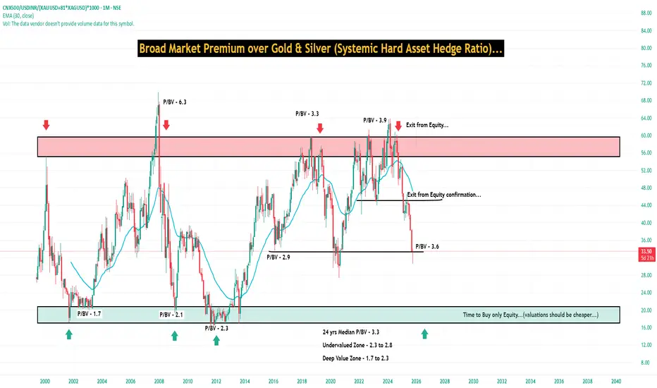
We can get closer to 90% to confirm asset rotation...We can get closer to 90% to confirm asset rotation...with the help of Ratio charts...
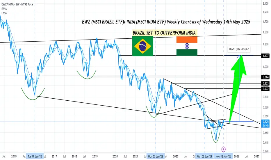
Brazil all set to Outperform India !Attached:
EWZ (MSCI Brazil ETF) vs. INDA (MSCI India ETF) Weekly Ratio Chart as of 14th May 2025
Technical Reasons:
- Brazilian Stock Market has been Underperforming Indian Stock Market since 2020 or roughly for 5 years
- Since last year June 2024 which was India's General Election year and also the same Month where Modi 3.0 won India's Election, since that date had you put money in both India and Brazil both countries have given on par returns
- However the entire period from June 2024 to May 2025 is an Accumulation Pattern signaling a Long Term Trend Reversal on the EWZ vs. INDA Ratio Chart
- The Ratio between the 2 Countries is also at a Multi Decade Low since 2012 and so the Odds for Mean Reversion to favor Brazil's Stock Market over India's Stock Market are high
Macro/ Fundamental Reasons:
- Geopolitics too says that Brazil (rather Latin America) has been positioning itself strategically to benefit from the Global Trade War between the 2 Super Powers USA and China. Meanwhile India has not been able to position itself to benefit in the New Geopolitical landscape in comparison.
- The Trend of US De- Dollarization benefits Latin America the most and Brazil is the largest economy of Latin America, this is reflected in the Currency Appreciation of the Brazilian Real
- CAPE Ratio for the Brazilian Stock Market is also in the Cheap territory while CAPE Ratio for Indian Stock Market is in the Expensive territory so the former is Undervalued while the Latter is Overvalued
Conclusion:
- Based on the above Thesis , one can expect the Brazilian Stock Market to Outperform the Indian Stock Market by a margin of 100% if not more in the coming few years
- One can expect the Ratio to get back at least to the Jan 2016 levels on a very conservative basis and the optimistic case would mean the Ratio gets back to the 2020 Jan high
AVTNPL: Monthly Breakout StockAVTNPL is a good company, and its fundamentals are good.
A stock from Small cap, which can show a good upmove for next few months.
One understand the chart properly to take your trades.
Monthly Trendline Support
Double Bottom
Base creation
Daily Timeframe Consolidation Breakout
Now watch this ratio chart of AVTNPL and NIFTY 500.
Three Major points to consider
1. Fibo 0.618 Support
2. Trendline Support
3. Double Bottom Creation
How am i trading in this stock?
I will start my trade by adding AVTNPL. My quantities will be less at start. My Stoploss will be 88 and Target will be 136.
With Increasing strength, and stock moving upside i will keep adding with trailing SL.
Trendline break and sustain will give me confidence to add more.
I will keep updating to this chart. So do follow!

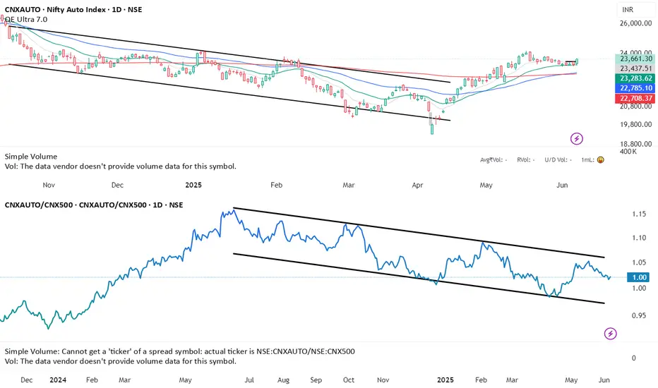
Diverging since 30th Nov: CNXAUTOI was taking a look at the ratio charts of sectoral indices to identify which sector though is going up but in relative terms is slowing down. The one that looked the cleanest is that of CNXAUTO.
1. On the LHS, we have the daily chart of CNXAUTO and on RHS a ratio chart of the AUTO index with CNX500.
2. One look at the blue and red zone, and you can see that since 30th of Nov’23 the CNXAUTO index per se has rallied, but the ratio chart has come down. This means that the rally has underperformed the rally of the broader market.
3. Is this a sign that the AUTO stocks will now correct? Need not be the case, but we can clearly confirm from these readings that the AUTO sector is likely to slow down, which means we are either headed for a consolidation or correction.
4. Considering the fact that the AUTO sector with the overall market is in a strong UP trend, I request not to go contra short blindly, but wait for enough signs of reversal, like a proper well-established divergence based on which you can attempt a sell trade.
5. If you are not into shorting, then do not look to go aggressively long on the AUTO pack at this juncture. Work on your stop losses if you have open positions and wait for better/ lower levels to accumulate.
Trade Well.

6 Touch Point With Curve Line breakout at ISGECOn the #ISGEC daily chart, 6 Touch Point With Curve Line breakout. The reversal is also confirmed by the #Nifty/ISGEC ratio chart. chart.
BSE: 533033
NSE : ISGEC
I compared #SURYODAY vs. the #Nifty and its peers from November 01, 2022, and discovered that it has outperformed both the #Nifty and its peers in the sector.
ONLY FOR #educational NOT SEBI REGISTERED #LEARNEARN
It's my analysis, and it's 100 percent possible that I'm wrong. So, please don't believe in me; do your own analysis before investing.

MARUTI Set to Outperform Nifty 50Attached: MARUTI/ NIFTY 50 Daily Chart as of 5th May 2023
This Ratio Chart has just given a Fresh Breakout Buy Signal implying that for the coming days/ few weeks NSE:MARUTI is all ready to Outperform and take Leadership for Nifty 50
Buy Strength and Sell Weakness
Hence, expect Buying Action in MARUTI Stock from here on is what the Charts say!

HEROMOTOCO- Relative Strength says BUY!Attached: HEROMOTOCO/ NIFTY 50 Weekly Chart as of 28th April 2023
The above Ratio Chart also called a Relative Strength Chart shows that the Stock HEROMOTOCO is set to Outperform the Index Nifty 50 and has given a Buy Signal on this Ratio Chart based on Elliot Wave Theory
Wave 1/ A was a 5 wave Impulse
Ratio retraced to 0.786 in Wave 2/ B as a 3 wave Corrective
AND NOW,
Wave 3/ C to the Upside is set to start/ has started already and this means the Stock is expected to Outperform the Market from here, making it a BUY as you always buy Outperformers because that is where the Strength is!
Note: The Stock has Earnings on 4th May, Thursday

Cement Stocks in DANGER!🩸Attached: Custom Cement Index/ Nifty 50 Daily Chart as of 21st April 2023
(Note: The above Chart is my Custom Cement Index made up of all the F&O Cement Stocks and this is the Ratio/ Relative Strength Chart version of it, against Index Nifty 50. This gives us an idea of the Relative Strength of the Cement Stocks and used to find out whether they are likely to Outperform or Underperform.)
Observations as follows:
Price based:
- A Clear Double Top Breakdown on the Ratio Chart with Break of Support accompanied by Bearish Power Candles!🩸
- The Ratio was in a Down Trend prior to the Range that formed. Presently the Ratio has rejected from the High of the Range and can head to the Low of the Range
- If you Zoom Out on this Chart or go to the Weekly TF, a Bear Flag/ Wedge Pattern is also visible
Indicator based:
- Daily RSI is now in Oversold (below 30) territory indicating a Strong Bear
- Daily MACD which was already in Sell has crossed below the 0 line
- DMI is in Sell and ADX may start to turn up
All the above Observations signal that the Cement Stock Basket is likely to Underperform🐻/ are Potential Short Candidates📉 !
Some names that have Short Setups are: ACC, AMBUJACEM (already shared in my Related Ideas), ULTRACEMCO, GRASIM, JKCEMENT

AMBUJACEM- Relative Strength says SELL!Attached: Ambuja Cements/ Nifty 50 Daily Chart as of 19th April 2023
A Classic Triangle Setup is visible in the above Ratio Chart
The Breakdown of this Triangle would result in the Ratio Selling Off (AMBUJACEM accelerating its Underperformance vs. Index Nifty 50)
Hence this makes the Stock a Sell Candidate based on Weakness
Well if you also look at the Price Chart which I have not shared here but it also has a Classic Triangle Setup with a Bearish Bias just like its Ratio Chart

GAIL- Relative Strength says BUY!Attached: GAIL/ NIFTY 50 Daily Chart as of 12th April 2023
As you can see in the Attached Chart, there are 3 Bullish Signals hinting that the Ratio Chart is likely to Rally Up:
1) Cup and Handle Pattern Breakout (see Green Neckline)..... whose Target is still Pending as the Chart works its way up
2) Falling Wedge Breakout (see Wedge Blue lines)........ this is clear with today's Candle
3) Price (Ratio in this case) Moving Up within the confines of a Channel (see Black Channel)
The Upside Target is shown by the Green Arrow Mark Extending
Being a Relative Strength (Ratio Chart) the Signal we get from this says that GAIL is likely to Outperform Nifty 50 in the coming days/ few weeks

ITC to FMCG Ratio ChartITC is outperforming FMCG Index by a big margin and it has given a rounding bottom breakout on weekly charts. All other FMCG Stocks are getting hammered sue to serious high valuations, however ITC which is undervalued is getting attention from portfolio managers and its being bought.
ITC is providing a high dividend yield above Saving rate which is attracting a lot of value investors focusing on low risk value in equities.

NIFTYIT/NIFTY at the Top of RectangleNIFTYIT/NIFTY ratio chart has been trading in a range for the last 9 months since Sep'20, as shown in the rectangle pattern. The chart is breaching the top trend line of the pattern with momentum.
RSI, the momentum indicator, never reached oversold conditions at the two times the ratio touched the bottom of the rectangle, indicating strength. The RSI is also well above 50 and in bullish zone.
Based on this ratio chart, we can expect NIFTY IT to outshine the NIFTY index in the coming weeks if a breakout happens successfully. We will be monitoring the price action and keep this segment updated as and when we see a successful breakout or a fake out/breakdown.

Infy: Sell the FlagIn my previous post this downtrend was anticipated quite far back See >>
Currently price is in the middle of the range (1015-921) specified in the above post, which is also around 61.8% retracement. Expect some pullback from this zone. But this pullback should be weaker and so far it is weak. Watch for price action before shorting. Any impulse on the upside above the flag will nullify this trade.
Setup: Bear Flag
Entry: Let the flag pattern complete and break on the downside. The higher the price goes in the flag, the better.
Stop: As per risk appetite
Targets: 951 and lower..see chart.

IT Rockets INCOMING IT Sector is set to propel again looks like. Weekly RSI at exhaustion similar to MAy'24 levels. DXY expected to rise with USDINR going above 90+ and perhaps till 95 too. Foreign gains in USDINR to aid IT stock margins. Existing Offshore employees don't need VISA H1-B 1 lakh USD fees, so that's protected. PE Rerating will also aid the returns. Ratio chart is at support. BRACE.

Relative Strength or weakness in Auto sectorLet's see if this makes lower high but this sector does not look the strongest for sure
Stocks in this index:
NSE:MARUTI,NSE:M&M,NSE:TATAMOTORS,NSE:BAJAJ-AUTO,NSE:EICHERMOT,NSE:TVSMOTOR,NSE:MOTHERSON,NSE:BOSCHLTD,NSE:HEROMOTOCO,NSE:ASHOKLEY,NSE:BHARATFORG,NSE:TIINDIA,NSE:MRF,NSE:BALKRISIND,NSE:EXIDEIND
Will have to check Ancillaries separately as there are many stocks which are coming in scans from Ancillaries space.
We are also facing rare magnets issue in the short term.
This is how you can use ratio charts to gain an extra edge.
Source: x.com
DISCLAIMER: NOT A SEBI REGISTERED ANALYST.
NO RECOMMENDATION TO BUY AND SELL
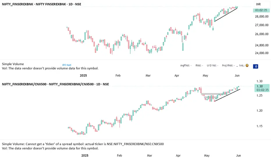
NIFTY FINANCIAL SERVICES EXCLUDING BANKSPrice is also moving up and Ratio charts also confirms this index is outperforming.
Stocks included in this index are:
NSE:ABCAPITAL,NSE:ANGELONE,NSE:BSE,NSE:BAJFINANCE,NSE:BAJAJFINSV,NSE:CDSL,NSE:CHOLAFIN,NSE:CAMS,NSE:HDFCAMC,NSE:HDFCLIFE,NSE:ICICIGI,NSE:ICICIPRULI,NSE:IEX,NSE:IRFC,NSE:JIOFIN,NSE:LTF,NSE:LICHSGFIN,NSE:LICI,NSE:M&MFIN,NSE:MFSL,NSE:MCX,NSE:MUTHOOTFIN,NSE:PAYTM,NSE:POLICYBZR,NSE:PEL,NSE:PFC,NSE:RECLTD,NSE:SBICARD,NSE:SBILIFE,NSE:SHRIRAMFIN
You can check individual stock chart to know which stock is strongest
DISCLOSURE: NOT A BUY/SELL recommendation.
NOT A SEBI REGISTERED ANALYST
Market bubbles are for real !MSFT vs CAT returns after the peak of 2000’s, The Dot Com Bubble! CAT has outperformed to the date. For a rough idea MSFT has given 800% vs CAT has given 1500% since 2000’s.
This does not mean the same will happen in the next 25 years. This ratio chart of MSFT/CAT shows that market bubbles are for real, at least in this case.
